A Guide To A Good Logo
While your brand is so much more than just a logo, your logo is a visual representation of your brand. Like any aspect of your branding, it needs to be carefully considered. So what makes a good logo? Let’s explore the key aspects now.
1. A good logo is simple
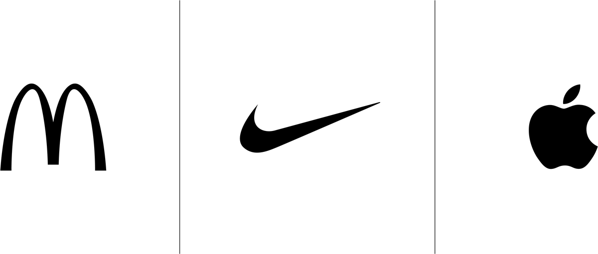
When it comes to good logo design, less is more. Think about some of the most recognisable logos – the McDonalds ‘M’, Nike tick or Apple’s apple. All of these logos have something in common – they’re simple. And generally speaking, simple—when executed well—is highly effective. Simple also means versatile and memorable, both of which are significant factors in what makes an amazing logo.
2. A good logo has balance and symmetry
The way the human brain works means we are attracted to symbols that conform to alignment, organisation, and structural soundness so these are all elements that constitute a good logo. Of course, you can also intentionally play with these elements to create an offbeat and quirky logo but this is definitely something to leave in the hands of a professional as it is a fine balance that can go very wrong very easily

3. A good logo is unique
While ensuring your logo is well-balanced and aligned, sometimes what makes a logo great is that it is unusual. This is generally where the complexity in logo creation stems from—how do you make a logo that is structurally sound and symmetrical while also being unique enough to catch the eye? This is yet another reason why leaving logo creation in the hands of a professional is paramount to your brand’s success.

4. A good logo is remarkable
Adding some intrigue or ambiguity can make a good logo great. If you think about it, we don’t market to people by simply listing all the benefits or features of our product to get people over the line—we create a unique, interesting, funny, or powerful story to catch their attention. While the rest of your branding should carry this aspect for you (especially your copy), a remarkable logo is the icing on the cake.

Some other things to consider when developing your logo.
- 33% of the top brands use blue in their logo. Blue is commonly used because it conveys trust and security—both of which most businesses want to be associated with their business. So is it blue that makes a good logo? Not necessarily. It’s not the right choice for everyone so always chat to your designer about what’s right for your brand.
- While a perception of a brand is built within 10 seconds, it takes between 5-7 impressions before someone will remember a logo. It’s not just repetition but also the consistency of experience over time that fosters strong brand recognition.
- Having a ‘signature colour’ can boost brand recognition by up to 80%. So regardless of which colour you choose to make your logo great, try to apply this across all aspects of your branding—from your logo to your website.
Let’s talk about your business.

